Trivector
Trivector – UX/UI
Trivector's mission is to optimize the transport systems in our society and to make them more sustainable. To get a greater understanding of how people travel they developed TravelVu – an mobile app that gathers information about its users travel patterns.
I was hired to function as a sounding board, helping transform TravelVu into a more userfriendly, 2.0 version. My focus was mainly on UX/UI, but also on the tonality and copy, making the app more appealing and easier to understand for first time users.
1. Design system
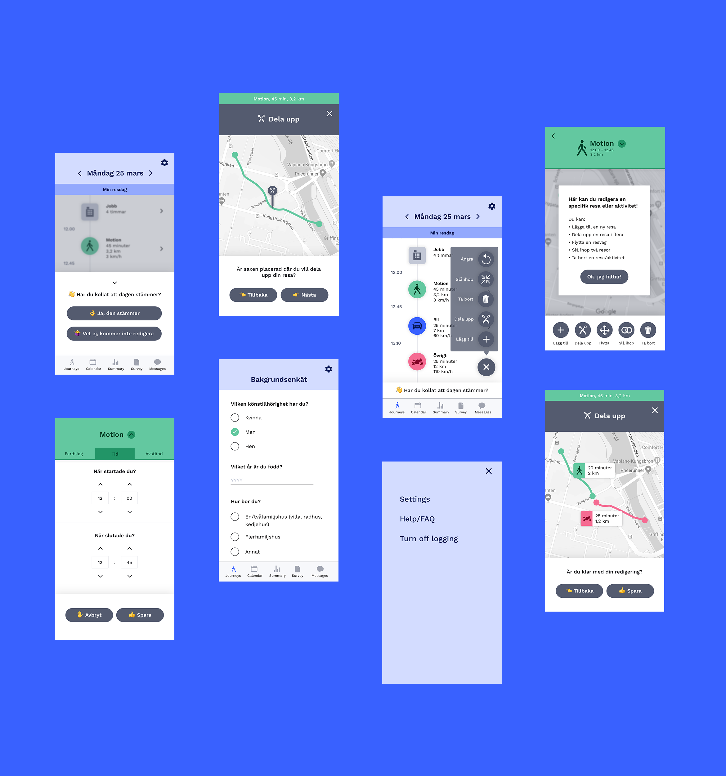
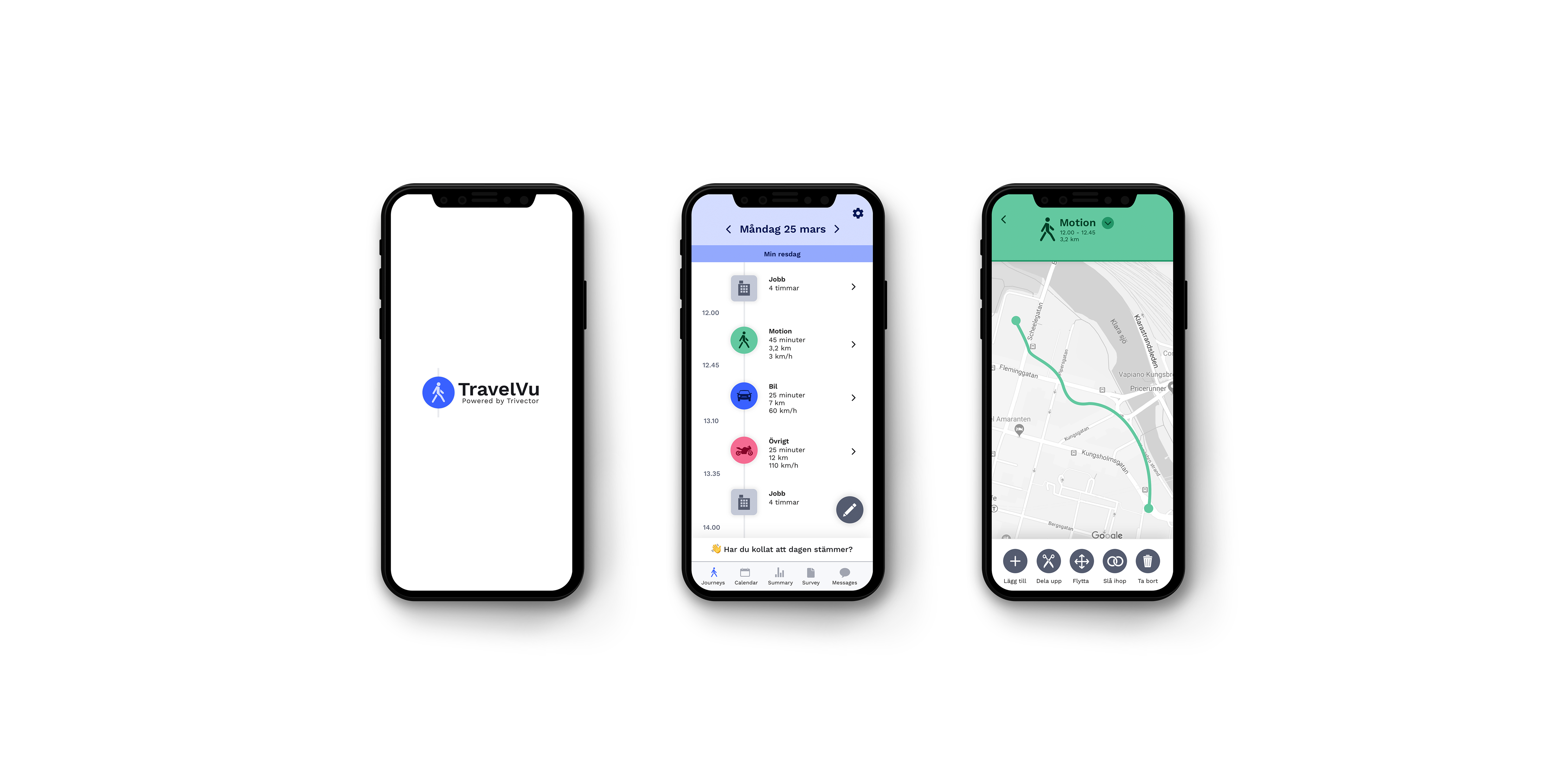
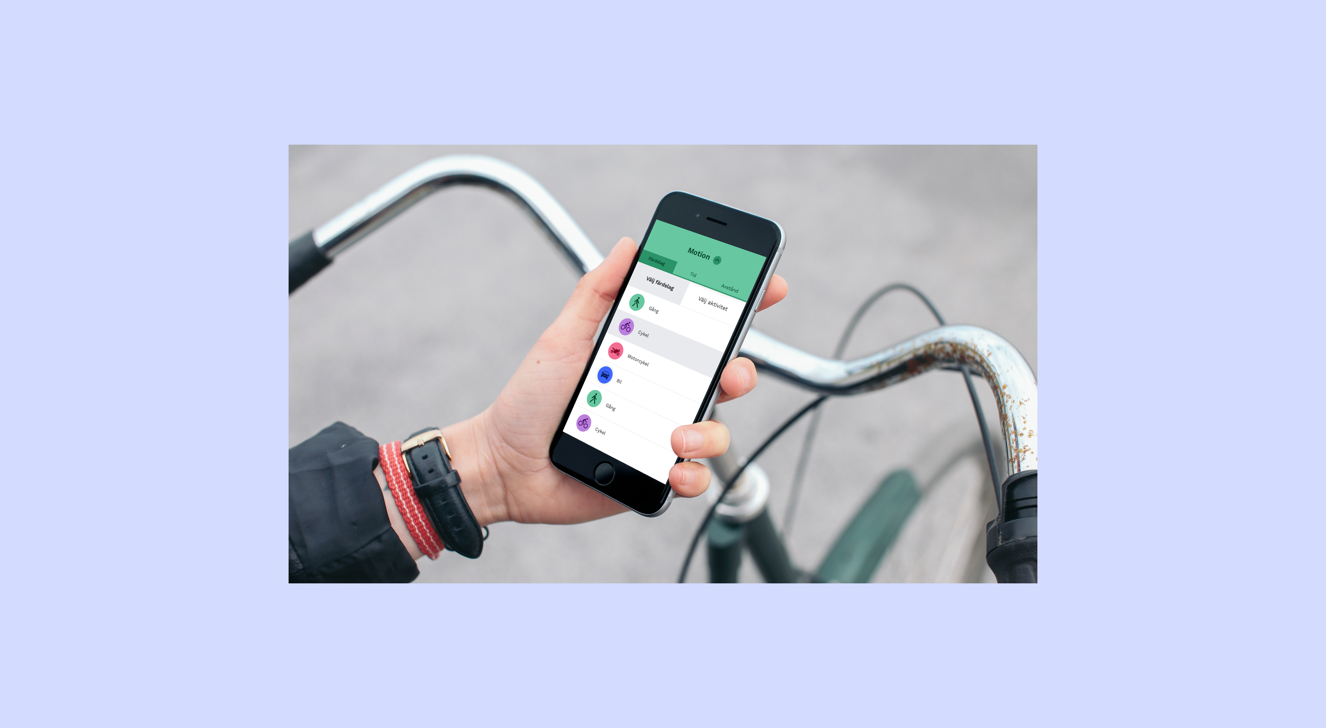
Due to the complexity of numerous of different transport systems, TravelVu needed a broad variety of colors and subcolors. Both helping users of the app to navigate more easily and also helping clients to analyze the data from the app.

2. UX/UI
Since most users of TravelVu will only use it one time, my focus was on the first time user. How can we get them willing to use the app and to not drop off in the middle of a survey? Getting rid of unnecessary functions, making the user journey less complex and more light-hearted was some of the changes I suggested. Also making the interface more contemporary and similar to apps that are frequently used by a broad audience. I also worked with the copy, focusing on finding a language and tonality that made the user journey easier to grasp.