
Hyper Island
Hyper Island - Rebranding
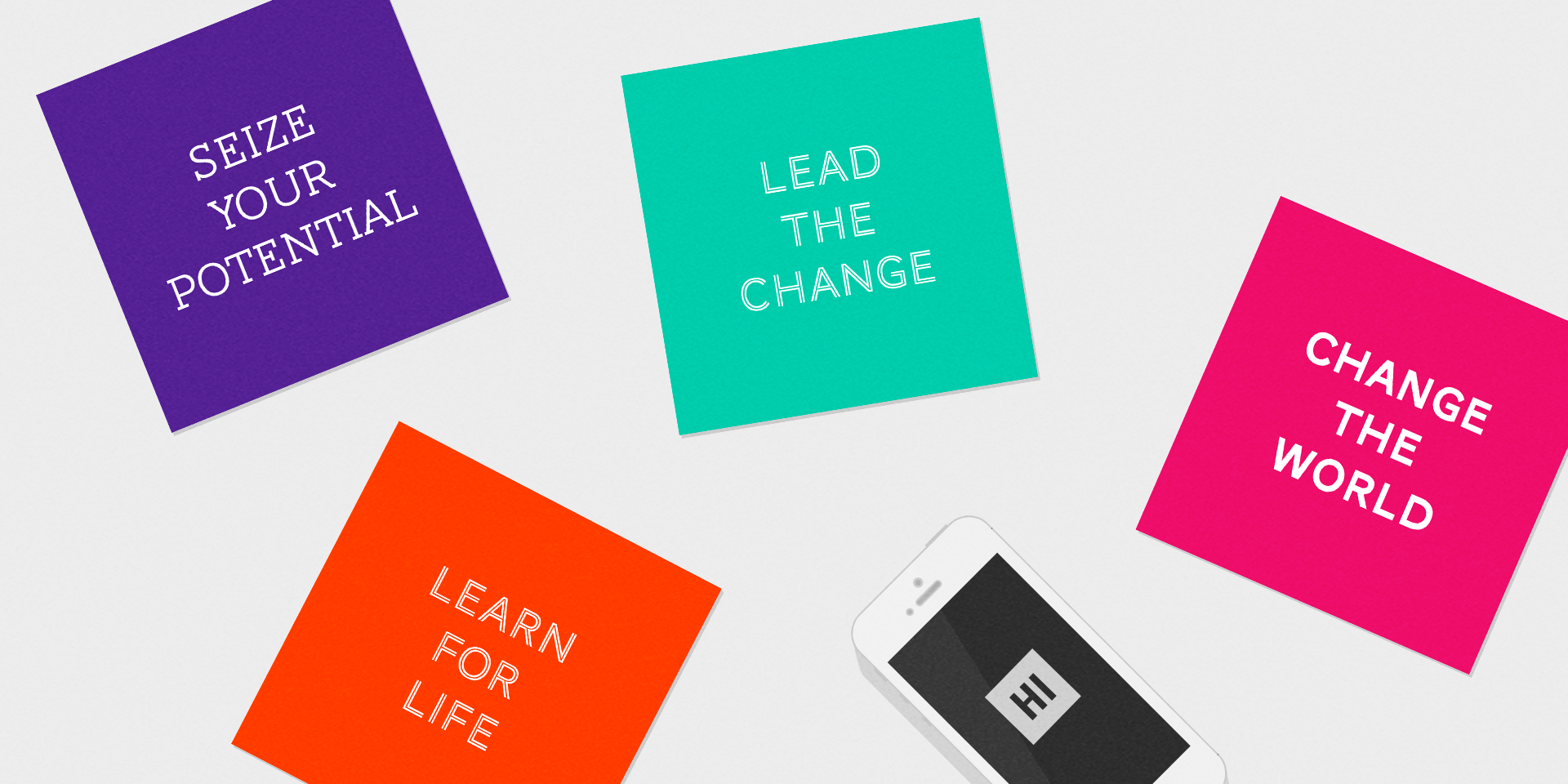
As Hyper Island expanded all over the world, the need for keeping the visual communication aligned became more and more important. The brand already had a strong core brand identity but the use of it differed from one another. I was hired to visually reunite the brand, adapt it to the current communication landscape, make it feel more avilable to the viewer and easier to understand. All of this without changing the core of the brand.
1. Colors
I added the "Faded" series to the existing color library. Four faded versions of the primary colors that allows more flexibilty and depth in the design.


2. Icons
I implemented the consisting use of icons and symbols as a strong communication tool, and helped Hyper Island to find their own graphic expression.
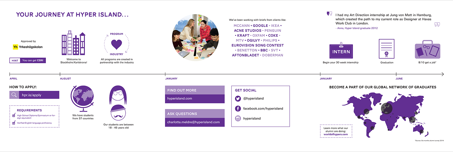

3. Imagery
Together with a photographer I started to build a new and expresfull photo library, showing the energy and creativity that is the core of Hyper Island.